F1 Timeline: Part Two (Implementation)
This is the second of a series of articles on the creation of the F1 Timeline in which I’ll discuss:
- acquiring and transforming the data
- coding (SVG, CSS, D3)
- optimisation
The design aspects are discussed in another article.
Acquiring and Transforming the Data
There are a few websites containing F1 data but the clear favourite for me was the Ergast Developer API which allows queries such as:
http://ergast.com/api/f1/current/last/results.json
that return JSON files.
I looked into using the API but it would’ve required a custom script to poll the API and assemble the results. Fortunately the database image can be downloaded. A big thank you to Ergast for this.
Once downloaded I imported the data into a local MySQL database and then exported the drivers, races and results tables as JSON files. It’d be possible to load these JSON files directly into the visualisation but with the results file being 6.9Mb this would require too much bandwidth (and load time).
Instead I wrote a Python script to transform the three JSON files into two smaller JSON files containing the required data only:
- drivers.json:
[
  {
    "name":"Daniil Kvyat",
    "dob":"1994-04-26",
    "races":[900,901,902,903,904,905,906,907,908,909,910,911,912,913,914,915],
    "pos":[9,10,11,10,14,0,0,0,9,0,14,9,11,14,11,14]
  },
  etc.
]
- results.json:
{
  "1":{"name":"Australian Grand Prix","date":"2009-03-29"},
  "2":{"name":"Malaysian Grand Prix","date":"2009-04-05"},
  "3":{"name":"Chinese Grand Prix","date":"2009-04-19"},
  etc.
}
As is often the case with the data, it’s never perfect! In this case there were some missing birthdates so I looked the missing ones up on Wikipedia and wrote some code to add these in. Apart from that the Ergast data was a pleasure to work with.
Implementation
The visualisation is implemented in HTML, SVG, CSS using D3 to help with the data visualisation side of things. The implementation of the visualisation itself (i.e. the graphical marks) was pretty straightforward from a coding point of view.
Instead the majority of the effort went into detail design and coding the user experience such as the story-telling and interactivity. Apart from D3 and a useful scrolling gist from Nikhil Nigade the visualisation was handcrafted.
Optimisation
One of the more interesting aspects of the implementation was optimisation. Over 22,000 data points are being loaded in and displayed and I was surprised at how well Chrome handled this. Even my six-year old Dell laptop handled it without a problem. Having said this, on less powerful platforms such as my iPad Mini there was a noticeable lag between page load and the visualisation appearing.
To investigate the cause of the lag I implemented a profiler which was platform agnostic:
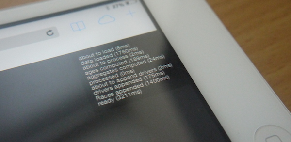
The two main bottlenecks were:
- loading the data (AJAX request)
- adding the 22,000 or so DOM elements (no surprise there!)
The first issue was dealt with by aggressively optimising the format of the JSON files. For example, I used separate arrays for the race IDs and positions rather than having an array of races where each race is an object. This avoids redundancy in object key names.
The Python JSON encoder also has an option for compacting the JSON. With these and other measures I managed to reduce the file size from 275Kb to 188Kb. Using gzip compression on the server reduces this even further to 102Kb which is pretty impressive considering the amount of data.
Given more time I’d have investigated the second issue in more depth. However, due to limited resources I devised a crafty fix. I knew that the first thing the user would see and read would be the first story popup:
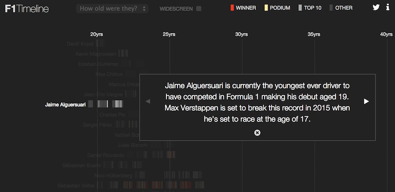
Assuming the user doesn’t immediately scroll down, the first (visible) few drivers are added to the DOM straightaway then after a delay the reamining ones are added. Thus creating an illusion that the data loads quickly.
Another hold up was a loop that pre-computed the driver ages for every single result. Rather than have the browser do this work I decided to do it once and only offline, adding driver race ages to the drivers.json file e.g.
[
  {
    "name":"Daniil Kvyat",
    "dob":"1994-04-26",
    "races":[900,901,902,903,904,905,906,907,908,909,910,911,912,913,914,915],
    "pos":[9,10,11,10,14,0,0,0,9,0,14,9,11,14,11,14],
    "age":[19.9,19.94,19.96,20.0,20.05,20.09,20.13,20.17,20.21,20.25,20.27,20.34,20.38,20.42,20.46,20.48]
  },
  etc.
]
Thus at the expense of a bit of extra loading time some processing time is saved.
These optimisations added together resulted in seconds being slashed from the load time.
Summing up
I hope this article gives a flavour of the work that goes into a data visualisation such as this one. I find that every project is different in nature and in this case the majority of the effort went into user experience, detail design and optimisation. The data acquisition, transformation and initial visualisation stage was unusually short in this case.
Overall I think that this has been a very successful project and I still love exploring this huge dataset using the visualisation.
If you’re interested in me helping you on your own data visualisation project then please do get in touch to discuss.